The First Two Screenshots Do the Heavy Lifting
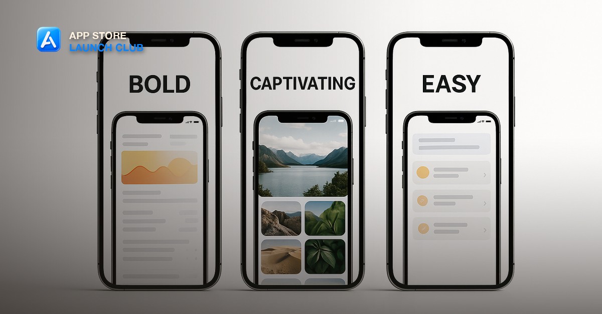
In the App Store, users see two screenshots (portrait) or one (landscape) before they have to tap to see more. These two frames are your entire pitch to most browsers. If they do not understand what the app does and feel pulled to install in those two frames, they are gone. Lead with your single clearest value statement and the most visually striking screen in your app.
Caption Text: Benefits, Not Features
The caption line overlaid on each screenshot should speak to what the user gets, not what the feature is. Compare: 'Custom reminders' vs 'Never forget what matters'. 'Progress charts' vs 'See yourself improving'. 'Dark mode support' vs 'Easy on your eyes at night'. The second option in each pair answers 'so what' and is more likely to prompt an install.
Design Tips That Move Conversion
Use device mockups (phone frame around your actual screenshot) rather than raw screenshots - they look more professional. Consistent color palette across all screenshots creates visual cohesion. Dark mode screenshots convert slightly better on average, possibly because they look premium and contrast more against App Store white backgrounds. Caption text should be large enough to read in the thumbnail without zooming.
- Match caption font to your app's brand font for cohesion
- Use a single accent color for caption backgrounds across all screenshots
- Show real UI - never use polished mockups that do not match the actual app
- If your app has social proof (ratings, user count), include it in screenshot 2 or 3
The Last Screenshot
The last screenshot is the CTA. Many apps waste this slot on a generic feature. Use it as a value recap and a reason to install: 'Join 12,000 people who shipped their first app' or 'Start free. No credit card required.' Treat it like the final punch of a sales email - a reason to act now.
Short, practical drops on app ideas, validating fast, store listings, and passing app review. No spam, unsubscribe anytime.
Frequently asked questions
How many screenshots should I include in my App Store listing?
The maximum is 10. Use at least 5. The sweet spot is 6-8: enough to tell the full story without becoming repetitive. Each screenshot should communicate something the previous one did not.
What tools do people use to create App Store screenshots?
Figma with device mockup frames is the most common. AppScreens.io and MobileShots are paid tools that automate the layout. Claude Code can generate and iterate on screenshot layouts quickly if you describe what you want.
Do App Store screenshots affect search ranking?
Not directly - keywords affect ranking, screenshots affect conversion. But higher conversion rates send positive signals to the algorithm, so well-converting screenshots can indirectly improve your store position.
Last reviewed by David on August 1, 2026